
OttawaAgent.ca
Ottawa Real Estate - How's The Market?
Facts, Data, No-Spin Analysis
There are three questions everybody asks me:
- Who are you with (what company do you work for)?
- Where do you work (what part of the city, rural, small towns, waterfront)?
- And, most of all... "How's the market?"
One of the reasons I love working in real estate is that pretty much everybody finds it interesting. I have the privilege of access to raw data that I'm able to study every day and share with these interested people. If you're one of them, and you're looking for the latest raw Ottawa real estate market statistics, you can count on me to share the straight facts. Visit this page whenever you need the latest data, or sign up for my newsletter to put your regular updates on autopilot.
Jump to the latest Ottawa real estate market statistics HERE.
Data, Not Spin
Media reports and industry news releases like those from the Ottawa Real Estate Board (OREB) often bend over backward to put a positive spin on the statistics. If you're looking for the facts, and some insights into what those facts might suggest about the market, "good" or "bad", my newsletter is for you.
Free Samples 🙂
He who hesitates is lost! Separating the wheat from the chaff is an ongoing battle. Ottawa Real Estate Monthly (OREM) is refreshing, original content. It's not a cut & paste of the Ottawa real estate board's news release that you find on 600 realtor blogs in the City. These are takes you won't hear from other real estate agents.
Sign-Up for OREM
An edgy, informative, and (I hope) entertaining read, focused on facts and data, information about new developments, legal and financial issues in real estate, plus the occasional crazy real estate story.
Ottawa Real Estate Monthly
Ottawa Housing Market - Current Statistics
These four tables include all MLS data for activity within the greater City of Ottawa.
The first table includes all properties whose use is single family.
The following three tables categorize single family home data by property type.
Detached and semi-detached single family properties include those with secondary dwelling units (but not duplexes).
The townhouse category includes freehold row units, condominium row units (i.e. "garden homes"), and stacked townhomes (freehold and condominium). Essentially, all row units. Some townhouses might feature secondary dwelling units.
Single family properties in the apartment category are condominium apartments only - in the past, the "condominium" category included all condominium class properties (row units, stacked townhouses, etc.), but most people for practical purposes think of condominium apartments as a distinct class.
The new categorization reflects this practical way of thinking.
About Real Estate Market Statistics
It's not hard to find real estate statistics for Ottawa or Ontario or Canada online. What isn't so easy is finding an objective guide to interpreting those statistics. Facts and data matter.
Figuring out what they mean, not spinning them to fit your agenda, is key.
Here I outline some fundamental housing market metrics and discuss what they mean and how they can be misleading or misinterpreted.
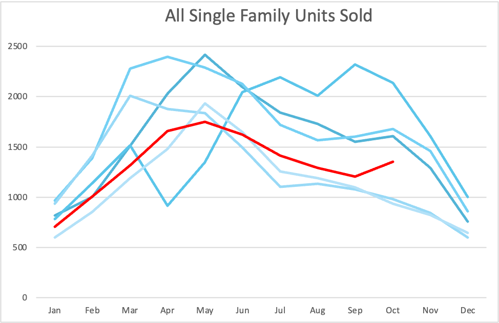
Arguably the foundational real estate metric: sales volume. How many homes are selling? Break it down by type (detached, townhouse, apartment), ownership form (freehold, condo) or location and map it over a period of time.
Sales Volume
Sales Volume
The number of homes sold (that is, sales volume) over a specified period of time is a simple count of Ottawa home sales. Sounds like a statistic that requires no interpretation, doesn't it? But there are factors intrinsic to the data that must be considered before jumping to conclusions about market trends: seasonality, sample size, location, and time period for starters.
It is amazing how often I read reports from realtors claiming a huge upswing in sales based on 25% more sales in March than February, for example. Big deal! That happens every year - the key question here might be: how did the magnitude of the upswing compared to last year? The five-year average? The percentage may be high, but how to the absolute numbers compare historically? Is the distribution even across property types and locations?
Many underlying factors influence sales volume. The Canadian economy, the Ontario economy, the Ottawa economy, Ottawa's population growth, a major health or other social concern, new mortgage rules, changes in prime lending interest rates, changes in mortgage interest rates, a pending election, a recent election - the list is endless. The precise impact of these factors is an equation we typically cannot solve definitively, yet people will make conclusive statements in market reports.
To fully characterize the market to help us make better decisions about buying and selling, we must analyse the number of sales in conjunction with other statistics, like available inventory. In combination, many metrics give us a clearer picture. A key question to ask about each statistic is, "does this data tell us more about buyer or seller behaviour?"
Every statistic is influenced by the behaviour of both groups, but most are driven more by one than the other. Do you think sales volume tells us more about buyers or sellers? These are the questions we ask when examining market data when we are advising you on marketing or offer strategy when you are buying or selling property.
How much homes are selling for is probably everybody's favourite statistic. But how much weight to put on one month's data? Who drives house prices - buyers or sellers? Or is it all about interest rates & the broader economy?
Average Price

Average Selling Price
The average selling price each month gives a basic idea of where Ottawa housing market prices are relative to the past. However, the number of sales each month is a statistically small sample set (ranging from about 600 to 3,000 in Ottawa and Eastern Ontario through MLS services) and therefore the average price over a single month of transactions is a number that shouldn't be taken too seriously on its own.
More importantly, the mix of property types and locations of Ottawa home sales each month can vary substantially. This alone can skew one month's average price. Average price bounces around throughout the year. To account for variations in housing stock, the MLS House Price Index (HPI) is a more robust measure of home price trends. HPI represents normalized prices. I periodically report on HPI data in the newsletter.
Year-to-date average prices derive from a large sample set and thereby provide a clearer view of absolute prices ("absolute" as opposed to "normalized" via the HPI), but still don't account for changes in the mix of property types and locations that have been selling. It's imperative in making your real estate decisions to understand that overall market average prices do not correlate with the prices in a specific neighbourhood or of any individual property. If you're assessing the value of a property for purchase or sale, it's crucial to perform a detailed market analysis for that specific property in its particular location at a specific point in time.
Do property prices tell us more about buyers, or sellers? You'll find periodic examples and discussion on this topic in my newsletter and articles in my Critical Thinking Blog.
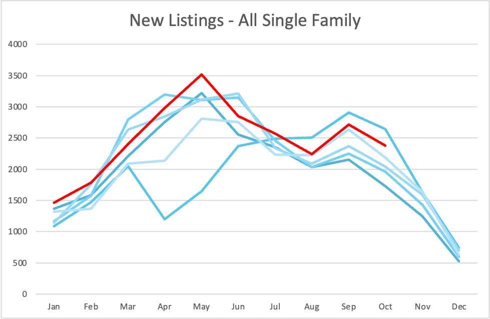
One of the most misunderstood foundational statistics: new listings hitting the market. Did you know that a "new listing" does not necessarily even add to available inventory? What are you talking about, Bruce?
New Listings
New Listings
The number of new listings entering the Ottawa housing market over a given period of time is another fundamental metric. It doesn't rely directly on any other statistic and by that measure is an almost pure indicator of seller behaviour in the market.
Keep in mind that in a slow market, properties that do not sell when listed for a period of time are often re-listed. This is partly due to conventional expiry of posted listings (realtor contracts with sellers are typically 60 to 120 days in duration). Each discrete listing of a property counts as a new listing. This means that the number of new listings does not equal the number of entirely fresh inventory hitting the market.
Adding to the discrepancy between new inventory entering the market versus new listings on the MLS system, some agents make a practice of cancelling and re-listing properties on a periodic basis (monthly, or even biweekly) in a lame attempt to keep their listing "fresh" or appear as a new property hitting the market. There are strategies and tactics one can engage to effectively improve marketing performance for a property that is taking time to sell - simply cancelling and re-listing is effortless and disingenuous. Why hire an agent whose only weapon in a tough market is to run more paperwork? Most agents who practice period re-listing make no changes whatsoever to the marketing with each iteration. You deserve better: hire a realtor who thinks critically and has an active Property Marketing Plan.
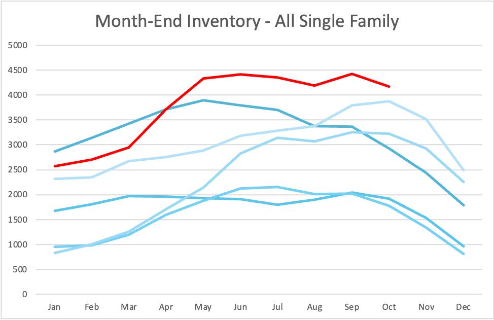
Available inventory is a full count of current housing supply in the real estate market. While some new listings sell quickly, others take longer to sell and some are taken off the market. The current pool of inventory represents your competition when selling and your opportunities when buying.
Inventory
Inventory
Like most statistics, inventory statistics are typically captured and reported monthly. Month-end inventory is a straight count of the number of properties on the market at the end of each month. Reports generally offer breakdowns by property type. From month to month, currently available inventory is equal to:
- Inventory at the end of the previous month,
- plus new listings this month,
- minus property listings that have expired or been cancelled,
- minus properties that have sold firm (no conditions, or conditions removed by month's end)
Inventory represents choice for buyers and competition for sellers. Continuously rising inventory suggests momentum in favour of buyers in the market, while continuously falling inventory begins to favour sellers. In Ottawa and Eastern Ontario there is a seasonal curve to the flow of inventory. From January through May or sometimes June, overall market activity increases - sellers lead the way (inventory grows), while buyers take some time to shop around and complete their purchases. The balance between available inventory and buyer demand impacts the lag between properties hitting the market and properties being sold. Inventory grows in proportion to the lag time.
About Statistical Time Periods
The time period over which you measure a statistic (or metric) shapes what that metric indicates about current market conditions. Individual monthly statistics do not represent a trend nor necessarily indicate the beginning of one.
For example, a spike in new listings one month may be statistically irrelevant. New listings can jump because a bunch of listings expire at the end of the month and most property owners re-list the next month. "New listings" measure the level of intent of property owners to sell. Fresh new listings replenish inventory as properties sell.
Inventory combined with new listings help us dinstinguish selling intent from true supply. Year-to-date new listings stastically smooth out seller behaviour as the year progresses, indicating the rate at which sellers enter or re-affirm their position in the market.
Annual average price changes can obscure actual price momentum. Here's an example: average annual appreciation in the Ottawa & Eastern Ontario markets in 2022 and 2023 were recorded as a 7.0% increase in 2022 (relative to 2021) and 5.3% decrease in 2023 (relative to 2022). But the reality is that all of the slide in prices occurred in the second half of 2022. Prices in 2023 rose gradually throughout the year. If you weren't looking at the whole picture, including an analysis of price trends over various time periods, you might have made poor decisions when negotiating your purchase or sale.
How long can you expect it to take to sell your home? Average time on market, usually expressed as "days on market", sets expectations for sellers and impacts your planning when carefully considered.
Time On Market
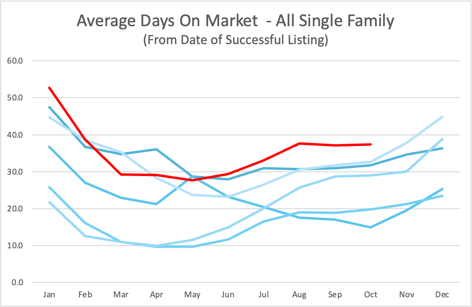
Time on Market
Average time on market counts only listings that have sold firm. Furthermore, this metric counts discrete listings and does not take into consideration properties that have been re-listed. If a home is on the market for 75 days under one discrete listing with a unique MLS number, fails to sell, is re-listed under a new MLS number with or without changes to the listing content, then sells in 6 days, the sale of the second listing will contribute "6" to the average days on market statistic.
Your project plan for selling your property must be built on an accurate understanding of how long it will take to sell. And that cannot be determined by simply looking up or quoting from memory the current average days on market statistic for the Ottawa housing market or Eastern Ontario housing market.
If you're house hunting and asking your agent how long a property has been on the market, be sure they research the property's entire listing history rather than only how long the current listing has been active.
Average time on market does not indicate the current success rate of Ottawa home sales because properties that fail to sell are not counted. Real estate boards and the vast majority of realtors do not report on listing success rate. I occasionally report on this crucial market indicator in my newsletter by analysing reported MLS data in combination with direct database queries.
Listing success rate is a statistic I share with you during a selling consultation. I calculate the current success rate in the precise neighbourhood or building (for condos) of the subject property. This is a key piece of information ignored by most people, that informs your pricing and positioning strategies. Or whether it is in fact a good time to sell.
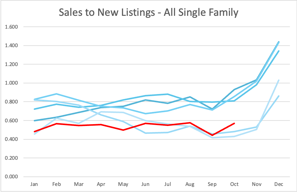
A commonly employed indicator of market momentum, this is one of the most confusing metrics because the time period over which it is measured dramatically impacts its value and what it suggests about market momentum.
Sales / New Listings
Sales to New Listings Ratio (SNL or SNLR)
The simple ratio of the number of sales in a given time period divided by the number of new listings in the same time period, has been used for decades as a measure of market momentum. The lower the ratio, the more inventory is growing - there are more sellers than buyers in the market - pushing things toward or further into buyer's market territory.
A higher ratio of sales to new listings indicates that properties are selling faster compared to the number of new listings hitting the market - the higher this ratio goes, the more momentum shifts toward or further into seller's market territory. Traditionally, a ratio from .4 to .6 is thought to represent a balanced market. Higher than .6 reflects seller's market territory, and lower than .4 is a buyer's market.
The weakness of this statistic is that it is momentary. Typically it is reported on a per month basis, measuring a short window of activity. This results in a strong seasonal component to the ratio. Early in the year, new sellers enter the Ottawa housing market, and there is a lag as buyers explore and ultimately purchase this new inventory. Later in the year, not as many sellers enter the market but many buyers who have been searching for months will continue to hunt for and purchase the home they've been seeking.
The most glaring misinterpretation of this metric occurs between December and January. These are the two lowest sales volume months of the year, but few people put their property on the market in December while in January new listings usually spike. This is partly because of a post-holiday re-listing trend (many sellers take their property off the market in late Fall and re-list between January and early Spring). The substantial difference in new listings in December and January causes the sales to new listings ratio to plummet, but more often than not, underlying market momentum does not change significantly from one month to the next.
For this statistic to mean something on its own, you have to compare the SNL curve over a longer time period (three to twelve months) to the same time period in previous years and ask yourself, is the whole curve higher, meaning more of a seller's market than last year? Or is it lower, indicating a market favouring buyers more than previous years? The simple SNL calculation on its own, based on data for three to twelve months, gives a sense of market momentum based on the .4 to .6 range outlined above.
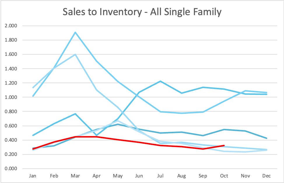
Similar to the sales to new listings ratio, this statistic measures the ratio of sales to total inventory each month. Measuring against all listings on the market, not just new listings, reflects market performance based on all properties actively for sale.
Sales / Inventory
Sales to Inventory Ratio
Buyers do not only purchase new listings and therefore this is a better measure of market performance as a whole. A sales to inventory ratio of .2 or more over a given time period indicates solid turnover. The higher the ratio above that, the more the market favours sellers. Below .2 is decidedly buyer's market territory.
This ratio almost never drops below .2 in Ottawa except on a temporary seasonal basis some years in late December or early January. In Ottawa, compared to expectations established over decades of living in arguably North America's most consistent real estate market, a ratio of less than .4 can "feel" like a buyer's market. We are simply not accustomed to homes sitting on the market for many weeks, let alone months. We are a little spoiled.
If this statistic measures buying activity against all properties on the market, why continue to track "sales to new listings?" The probability of a property selling on a given day decreases the longer the property has been on the market. A significant portion of standing inventory can be considered "stale". Some properties are over-priced, some are less desirable for a variety of reasons. There are also properties in niche markets with lower turnover. Perhaps the best example of a niche market is the luxury segment. Very high value homes often take more time to sell.
The sales to new listings metric gives us a read on uptake of "exciting new inventory", although in reality the statistic does not take into consideration which properties are being sold and how long they have been on the market.
Absorption indicates how quickly homes on the market are being purchased. You will see it expressed as "months of inventory" or "absorption rate". Absorption calculations combine supply and demand statistics, yielding a holistic view of market momentum.
Absorption
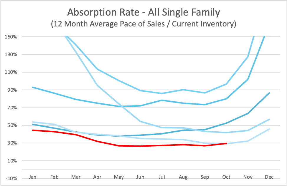
Absorption
The good thing about absorption metrics is that they combine supply and demand into one number, acting like a thermometer for market momentum. Absorption is calculated and reported in different ways.
Most sources calculate absorption by dividing active inventory (the current number of homes on the market) by the average number of home sold per month over a period of time. This yields a number that indicates how many months it would take to sell all current inventory if no new listings hit the market and the average number of sales per month remained what it was over the period used in the calculation.
For example, if you choose a time period of three months, and over the past three months there were 375, 325, and 300 homes sold, and there are currently 1,250 homes on the market, the absorption metric would be 1,250 / ((375 + 325 + 300) / 3) =3.75 "months of inventory".
Absorption is reported as "months of inventory" because it is a tangible number people can relate to. The less common way of expressing absorption is as a ratio or percentage: ((375 + 325 + 300) / 3) / 1,250 = 0.267, or 26.7%
This represents the rate at which homes have been selling over the period measured, based on current inventory. In the example, with a rate of 26.7% (or 0.267) you would expect 333.75 of the 1,250 active listings to sell over the next month if the average number of sales per month remains stable. Another way of looking at this: if you put your home on the market, you have a 26.7% chance of selling within one month. As a buyer, 26.7% of the available homes for sale will disappear in a month - you can gauge from this how quickly you may need to act before that home you have your eyes on sells to someone else.
What's most important about the absorption metric is the time period upon which the pace of sales is based. As noted above, most sources use a one-month time period. This reduces the absorption metric to the Sales to Inventory ratio. In my view, it renders the metric redundant. Absorption can be used to chart momentum in the market if it is based on a longer time period. I recommend 3 to 12 months.
Remember that new listings enter the Ottawa housing market each month, so there may be more than 1,250 - 333 = 917 properties on the market at the end of the next month (month-end inventory) in the example. The pace of sales (average number of homes sold per month) is always changing also and therefore more or fewer than 333 properties may sell. Employing a longer time period "smooths" out the rate of change, resulting in an absorption metric that is more indicative of longer term momentum in the market rather than providing a momentary measurement. A 12-month window can remove seasonality while a 3 to 4 month window removes monthly fluctuations, providing a somewhat less volatile indication of current market momentum.
Also remember that absorption is based on average monthly sales, and that sales are not all drawn from active month-end inventory - newer listings are often more popular in the market and could represent a substantial portion or even the majority of homes that sell over the next month. Time on market metric provides insight into the mix between sales of new listings and listings drawn from existing inventory.
Markets cycle more or less in the shape of a SIN curve. When a long term pace of sales curve starts to change direction, it has proven to quite reliably indicate movement through the curve from seller's market to buyer's market territory and vice versa.
Final Word
I hope you found this discussion of key real estate statistics interesting. When you engage me to represent you in buying or selling property in Ottawa or Eastern Ontario, we'll develop a data-driven strategy specifically tailored to nailing your objectives in current market conditions in your precise location(s). How we understand and apply market data to your advantage is crucial. A superficial reporting of real estate board numbers or a misunderstanding of what the data implies can lead you to inferior results.
Thank you for reading "How's The Market?" at OttawaAgent.ca