Ottawa House Prices By Neighbourhood 2022
Ever wonder whether neighbourhood A is more or less expensive than neighbourhood B? Or how about which areas are trending downward or upward? This ranking of Ottawa & Eastern Ontario communities is a great place to start, and I think it’s the only place you’ll find a simple leaderboard-style ranking with multi-year price ranking trends at a glance.
In the February edition of my newsletter every year, I rank all Ottawa and Eastern Ontario communities based on the average actual sale price of all homes and condos during the previous year. In other words, by the cost of buying a single family residence (i.e. a home or condo for a single family). Yet another way of putting it: ranked by how expensive housing is in the neighbourhood.
I divide the rankings into the top half table and bottom half table for ease of reading, but you can think of the first table – the “top half” of the rankings – as the most expensive places to buy a home in Ottawa and Eastern Ontario, and the second table as the most affordable.
I’ve been crunching the data and presenting these rankings for four years, and that’s given me the history need to add trending information to the tables to illustrate the trajectory of each neighbourhood. Has an area been consistently getting more expensive compared to other neighbourhoods? Has it bounced up and down the rankings? Was it dropping and has now turned a corner?
With four years of rankings in place, we have three changes in rank for each area, giving us a three step trending chain. Below the first table, I explain what the entries in each of the columns mean.
Ottawa House Prices By Neighbourhood 2022
Legend
Here’s what each column represents:
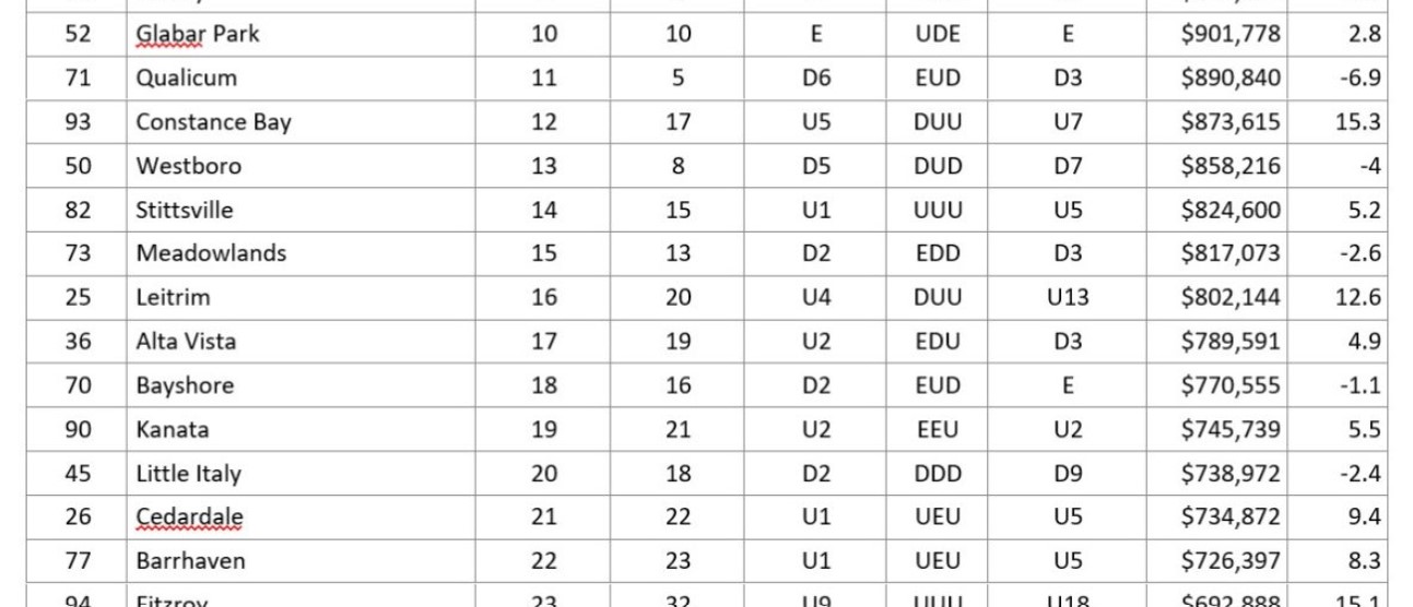
District – defined by MLS area codes. The areas were drawn many years ago and are updated now and then but not often, to allow us to track historical trends by area. What MLS labels as area “47” for example, is defined by specific boundaries and may include parts of several micro-neighbourhoods that people refer to as “Carleton Heights” or “Rideauview”. The common use boundaries and names don’t always perfectly align with the MLS boundaries but what’s important is that those boundaries are consistent from year to year. I maintain a list of smaller area names that are wholly or partly contained within each district.
Area – the most commonly used name for the general area and in most cases the area name represents the key neighbourhood that is wholly contained within the MLS district.
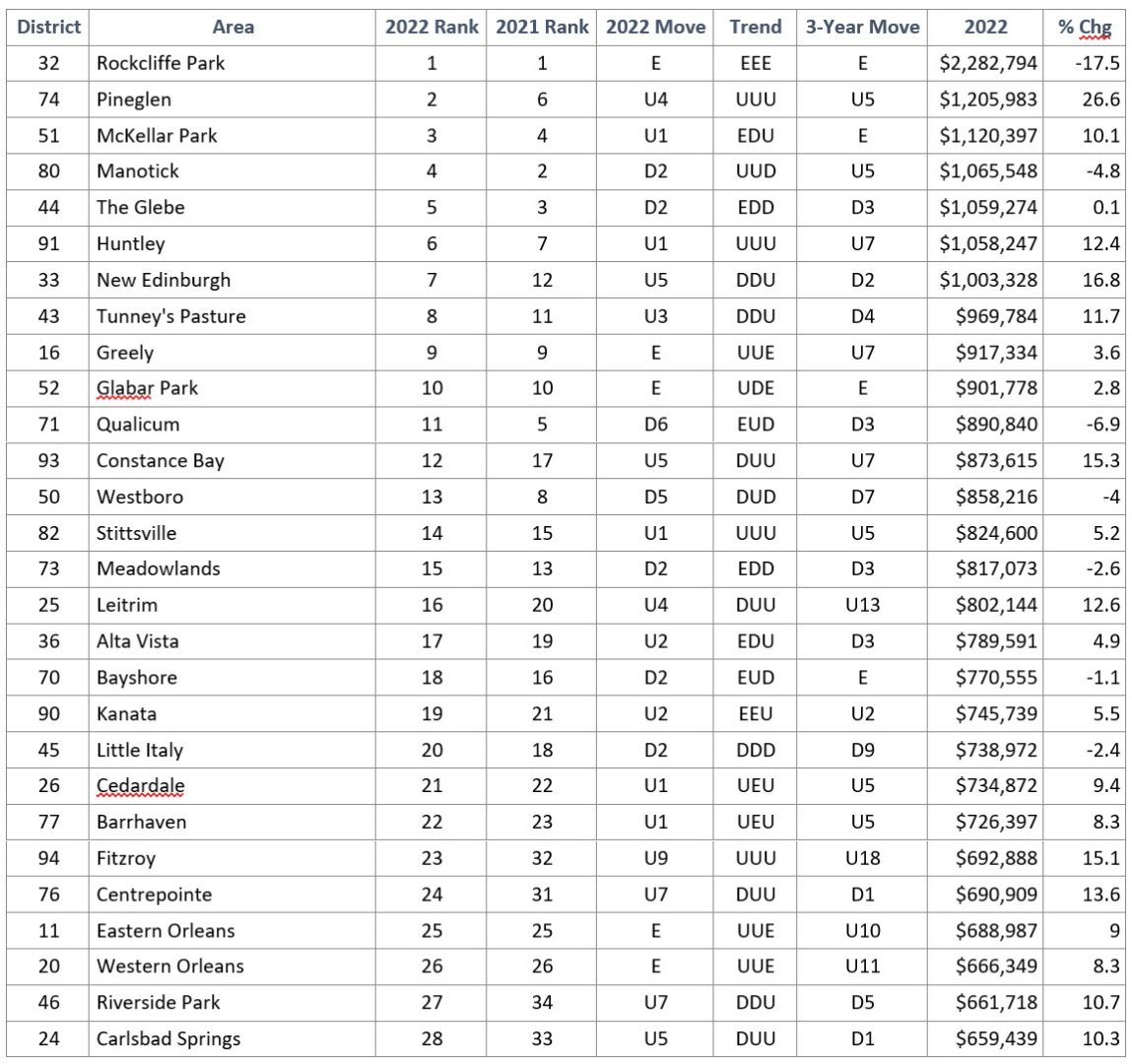
2022 Rank – straightforward – I’ve ranked every district by average selling price in 2022. District #1, Rockcliffe Park is where you paid the most, on average, for a home last year.
2021 Rank – same as for 2022 – where the district ranked by price in 2021. Note that these rankings are different than the top and bottom ten price “change” tables above. These rank neighbrouhoods by absolute price – not by how much they changed last year.
2022 Move – how much the district moved up or down the rankings in 2022 vs. 2021. So in 2021, Westboro for example, was the 8th most expensive neighbourhood in Ottawa and Eastern Ontario; but in 2022 it was 13th. It’s “2022 Move” was therefore D5 – “down 5 spots in the rankings”.
Trend – this is the exciting (I know you feel the excitement :)) new feature that tracks each area’s ranking trend. I’ll add the change each year going forward to the chain for each district. The letters used are: E = “even”, D = “down”, and U = “up”. So a neighbourhood with a UDU trend went up in 2020 vs 2019, then down in 2021 then back up again in 2022. This is most useful when combined with the next column (3-year move) because magnitude matters (up and down 1 or two spots doesn’t necessarily mean as much as up 14 spots).
3-Year Move – this is how many places in the rankings the district has moved since 2019 – i.e. over the past three ranking changes. An area may have moved up twice and down once (UUD) and end up either above or below its ranking from four years ago based on the magnitude of change each year. Perhaps it went up one place for each of two years and then dropped 8 places, for a D6 three-year move. On the other hand, it may have moved up substantially two times in a row and then settled out by dropping only a little.
My Newsletter
Enjoying this article? If you’re looking for the facts, and some insights into what those facts might suggest about the market, “good” or “bad”, this is the newsletter for you.
It’s an edgy, informative, and (I hope) entertaining read, focused on facts and data, information about new developments, legal and financial issues in real estate, plus the occasional story about the crazy things that happen out there helping people buy and sell real estate every day.
How’s The Market?
Ottawa Real Estate Monthly
My monthly newsletter is loaded with facts, data, and no-spin analysis.
The data here is quite rich, and there many factors impact how expensive housing is in a given area. With careful analysis of these rankings combined with research into a given subject property and sales of those comparable to it, one can make more prudent purchase and sale decisions. It may help identify areas that are currently undervalued or overvalued.
A straightforward reading and interpretation of these rankings is very interesting and quite useful. But thinking a little more critically, there are considerations lying beneath the surface, and some interpretations that could render the data more interesting and useful than at first glance. Here are a few considerations and ideas. If you have more, why not add a comment to this page, or drop me an email?
Hidden Factor – New Construction
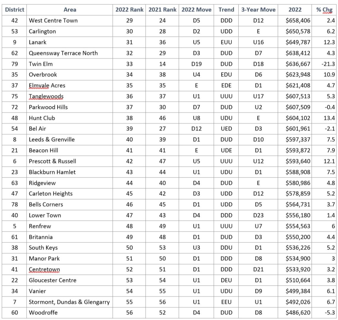
A neighbourhood such as Lower Town (MLS district 40) that has a DDD trend and total three year move of D23 (down 23 rankings) suggests that property values have been consistently falling in the area. And in fact they have – but does this mean individual properties have fallen in value? It may or may not – but the bigger factor is likely the development of hundreds of new small apartment condos in the Byward Market and Sandy Hill that sell for lower prices than the older existing housing stock of detached homes and row units in Lower Town. The mix of housing stock is changing dramatically in that neighbourhood, making it more affordable over time for people to live there provided the new type of housing suits their needs.
Hidden Factor – Different Housing Types
I recently had a client ask me to confirm that a certain neighbourhood was considered more desirable than an adjacent neighbourhood. I’d mentioned this was the case; that sometimes, crossing a major road or “the tracks” makes a big difference in desirability, which translates into property prices.
The client had noticed that sale prices on average seemed to be a little higher in the area that I’d mentioned was less desirable. This observation was accurate, but didn’t account for the different housing types prevalent in each neighbourhood. The less desirable neighbourhood comprised mostly fairly large detached homes, while the more desirable neighbourhood had a broad mix of housing types and was generally a large area with a larger sample size when looking at sales statistics.
The Canadian Real Estate Association (CREA) provides an MLS Home Price Index (HPI) capability that adjusts sale price information to normalize it based on housing type difference. For the two neighbourhoods in question, the HPI for the more desirable neighbourhood ran 5% – 10% higher over the past 40 years. The more desirable neighbourhood was further from highway noise, further from one particularly undesirable micro area, and further from some notably good schools. People will pay the same price for a semi-detached home in the better area than they will for a detached home in the less desirable area.
The neighbourhood rankings I analyse for this article and for my February newsletter each year is based on absolute prices, not normalized prices. When you start looking to buy or sell a property in any one of these areas, we look deeper at the factors that are driving the property’s value and make sure you’re making the tradeoffs that are right for you – with lifestyle and investment criteria in mind.
Notable Neighbourhoods
Let’s talk about a few notable neighbourhoods based on the ranking data and particularly the trends.
Pineglen
Pineglen has enjoyed an unbroken streak of rising in the rankings since 2019. It’s climbed 5 spots in total, which isn’t the biggest climb on the charts, but there isn’t really anywhere else to go. It is now Ottawa’s second most expensive neighbourhood. I bet when you talk to your friendly neighbourhood real estate expert, they are still talking about Rockcliffe Park, The Glebe, and Westboro being Ottawa’s “top” or most posh neighbourhoods. Well, now you have a great come-back conversation piece for them. All hail Pineglen.
Where is Pineglen? It’s a triangular pocket between the Rideau River and Merivale Road a little South of Hunt Club Road. More importantly, what is Pineglen? It’s a slice of country living inside City limits – spacious homes on large treed lots that lend a secluded feeling, built over time from the 1970’s through the 2020’s. The newer homes are generally larger and more luxurious than the older stock. In short, the area has grown in stature as people with the financial resources to build have discovered this now exclusive enclave.
Westboro
Westboro rose in prominence through the 2000’s and 2010’s and for a while was thought to have become the most expensive neighbourhood in Ottawa. In reality it never overtook Rockcliffe Park but it reached par with The Glebe and many home buyers looking in one of those two marquis neighbourhoods would consider the other to be an almost equivalent alternative.
Over the past four years, Westboro has become more affordable, dropping 7 spots in the rankings. Most of this effect is due to the change in housing mix again, with the construction of many condo buildings over the past 10 years. There is also the ongoing development of infill semi-detached and modern detached homes as some of the small, older homes are torn down. These projects have the tendency to increase the average price in the neighbourhood. The reality is that buying a freehold home in Westboro remains unaffordable for the majority of people, while condominiums offer the opportunity to live in the neighbourhood in style, if not with a ton of living space.
Orleans vs. Kanata
There is an ongoing narrative in the City that Kanata is the expensive suburb and Orleans is cheap. The rankings show that homes in Kanata are more expensive on average than homes in Orleans, with Kanata ranking 19th (up 2 spots from last year) and Orleans being a little more affordable sitting in 25th and 26th spots (Orleans being divided into East and West halves). What people may miss is how much Orleans has increased in value over the past few years, having climbed 10 and 11 spots (East & West respectively). The three-year trend column adds interest to this suburban comparison as well. The Orleans areas have a trend of UUE – up, up, even; while Kanata has run EEU, even, even, up.
Without interviewing hundreds of home buyers and sellers to confirm consumer behaviour, we can hypothesize based on the trending information what’s been going on. Presumably, while Orleans was considerably more affordable than Kanata for many years, demand increased as people found better value. Increasing demand drives prices upward, all other factors being equal. With Orleans catching up to Kanata in house prices, it makes sense that buyers now would find more even tradeoffs between the two areas and those more inclined to live in Kanata who in earlier years may have been lured to Orleans to get more house for the money, now find they don’t have to spend very much more for their first choice. More people making this call has created enough demand to bump Kanata up two notches while Orleans has levelled off.
There are many factors at play, but this suburban trade-off scenario based on the rankings and trending analysis illustrates how you can interpret this data to help you understand neighbourhood pricing and make better decisions about buying or selling a property for home or investment.