Ottawa House Prices by Neighbourhood 2020
The February edition of my newsletter (Ottawa Real Estate Monthly) features Ottawa House Prices by Neighbourhood – it’s a tradition I started a few years ago. I take all of the Ottawa Real Estate Board’s neighbourhood sales and price statistics and rank them. In previous years, I shared the top and bottom 20 neighbourhoods based on percentage change in number of home sales and average selling price. I had a light-bulb moment last week when I started compiling the data for this year’s February edition. I wanted to deal with larger sample sizes across the board, and as a corollary, stop completely excluding data from smaller communities, without sacrificing statistical integrity.
Estimated reading time: 7 minutes
I decided to use MLS areas rather than individual districts. There are 56 MLS areas comprising 385 MLS districts. As I thought more about the impact of the decision, I realised there are several compelling benefits and an additional way of looking at the data that is arguably the most interesting.
Neighbourhood Price Ranking
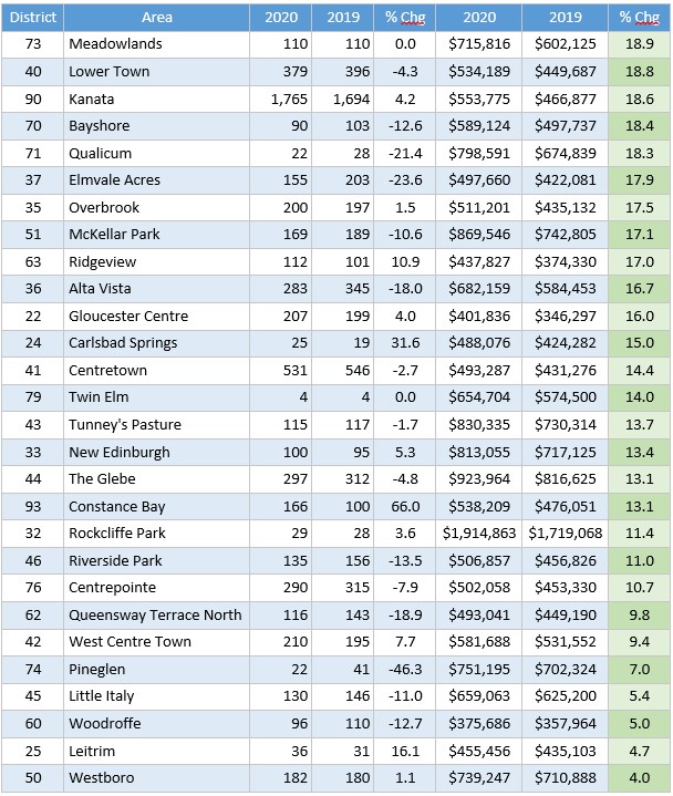
The following tables provide the complete ranking of all 56 Ottawa Real Estate Board MLS areas – first by percentage change in number of sales in 2020 compared to 2019 and then by percentage change in price. Each table is split in two – the top and bottom halves, for purely aesthetic reasons. Leaving them in one table creates a very long narrow table that doesn’t fit on one screen unless I reduce the font size to the point that I can’t read it.
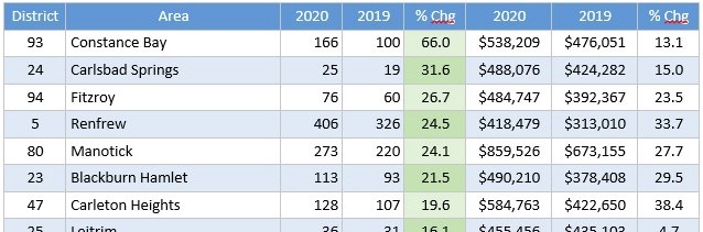
MLS Areas Ranked by Relative (%) Change in Number of Sales
Top Half
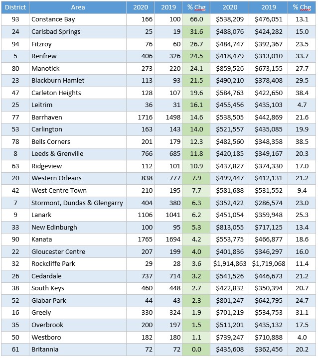
Bottom Half
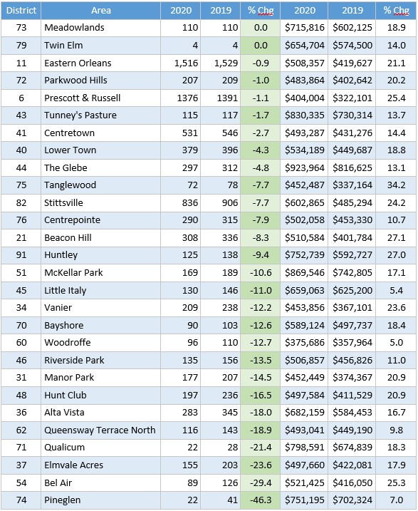
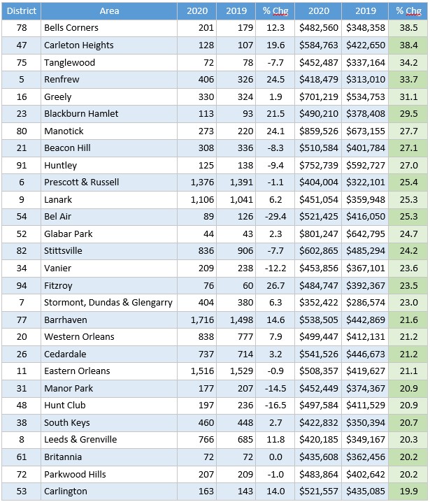
MLS Areas Ranked by Relative (%) Change in Average Selling Price
Top Half
Bottom Half
A couple of notes and observations about the tables and the data:
- I choose canonical names for the MLS areas; in some cases the area boundaries make the choice obvious, but other areas comprise many different communities with common names people ascribe them – anyone not familiar with the community may not be aware of the individual community names. I do my best without agonizing over it, to choose names that are most recognizable to the broader public and represent the general area.
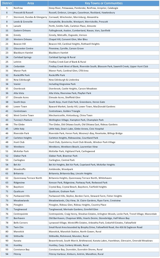
- I’m including a documentary table listing some of the key communities in each of the MLS areas. The breakdowns are not comprehensive, but should allow you to infer what’s in and what’s out if you’re looking at a map.
- There are a couple of MLS areas that are very small either in number of households only or in geographic area and number of households – this makes their data statistically unreliable and therefore their rankings more dubious than areas with more transactions.
- Most years, the percentage changes in number of sales and in average selling price range from negative double digits in some neighbourhoods to positive double digits in others; in 2020, that remained the case for number of sales, but for average prices, the smallest change was still positive – Westboro appreciated by 4.0%, coming in dead last.
- I share more observations and analysis in the newsletter, as I do every month, in an effort to help us understand the data and arm you with the information you need to make better decisions about buying or selling real estate in Ottawa and Eastern Ontario for home or investment.
My Newsletter
Enjoying this article? If you’re looking for the facts, and some insights into what those facts might suggest about the market, “good” or “bad”, this is the newsletter for you.
It’s an edgy, informative, and (I hope) entertaining read, focused on facts and data, information about new developments, legal and financial issues in real estate, plus the occasional story about the crazy things that happen out there helping people buy and sell real estate every day.
How’s The Market?
Ottawa Real Estate Monthly
My monthly newsletter is loaded with facts, data, and no-spin analysis.
MLS Area Guide
And Now For Something Completely Different
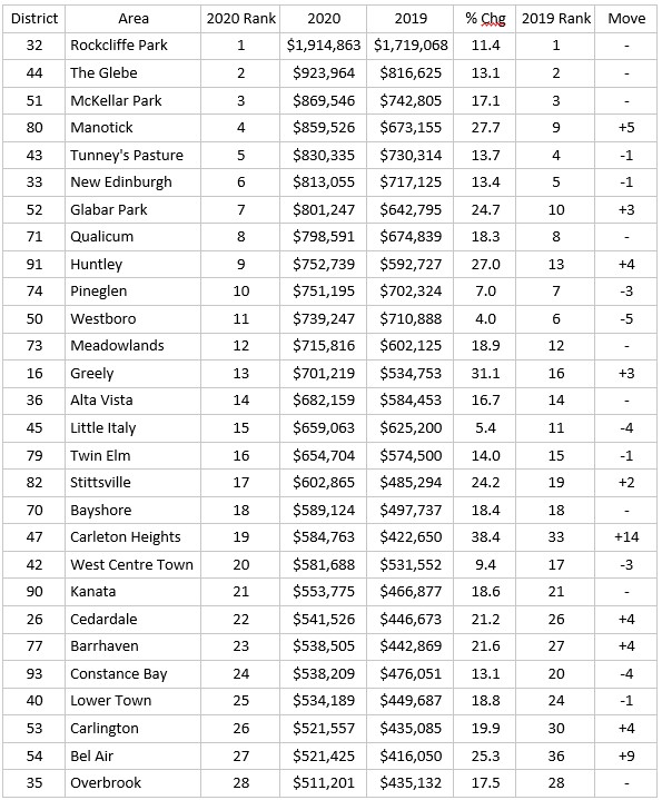
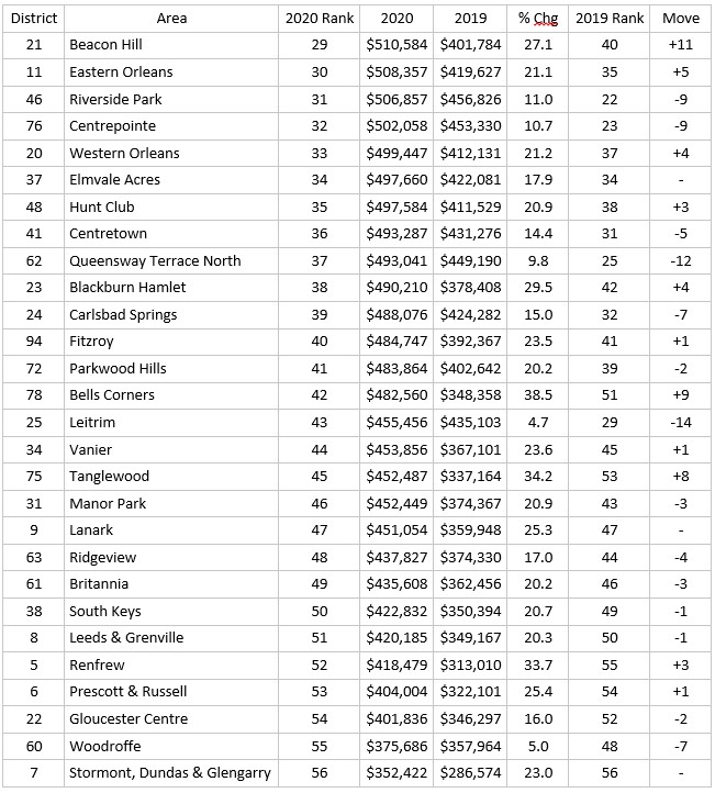
When I created the above sales and average price tables I sat back and started scrolling through the results, thinking, this is great. It was satisfying to see a complete list of all areas in Ottawa and Eastern Ontario, ranked by change in sales activity and change in price. I realised however, I’m ranking relative change in price. Which neighbourhoods appreciated the most and the least – or depreciated the most – as a percentage of the price of properties in that same area the previous year.
Interesting stuff, but…what about a list of absolute prices? Which Ottawa neighbourhood is the most expensive? The least expensive? Fifteenth on the list? Is Alta Vista more or less expensive than Little Italy? It’s great to know which neighbourhoods appreciated the most – but where does that leave them relative to each other? I thought, why don’t I rank all the areas by absolute price and track the relative expensiveness of every area in Ottawa and Eastern Ontario?
So I created a table ranking the areas by price, and then… another idea! I can compare the 2020 list to the 2019 list and see how each neighbourhood’s appreciation impacted its place on the list! This is like the FexEx Cup (golf) of real estate! Or the Grand Prix (formula one racing) of real estate! For each MLS area, did it move up or down the list in 2020?
I haven’t seen Ottawa real estate prices presented this way by any source – maybe there is one – but every article I’ve ever read compares appreciation. Absolutes matter when people are making decisions about where to buy or sell. Relative appreciation matters, but what’s more important is the impact it has on the affordability (or “prestige” due to expense) of a neighbourhood over time. Check it out!
Market Update Through January 2021
Also covered in February’s newsletter is a monthly update on the current state of the market. Every edition includes the latest statistics, to the end of the previous month. In January this year, the average selling price of freehold homes across the region was up 30% over January 2020. Of course, the “average” price doesn’t imply that each individual property is now worth 30% more, especially in a lower volume month like January – the sample space is relatively small (676 transactions) and therefore the happenstance of a higher value mix of properties selling can easily skew the average.
I tracked dozens of properties in January and more often than not was aghast at the final sale prices. I spoke about this in my first video of the year.
While relative condo sales volume bounced back up in January, average price escalation moderated further, for the fifth consecutive month; if volume continues to climb as it has done for two months in a row, perhaps condo price escalation will resume accelerating. For now, freehold & condo prices are diverging. The market stalled from April through June of 2020, but since then monthly sales have exceeded the previous year by a wide margin – that trend continued in January with 20.7% and 31.2% increases for homes and condos respectively.